Background Story
As an early team member at CoWrks, a vibrant co-working space, we were all about building the groundwork for a supportive, collaborative environment (while figuring things out ourselves!).
Our top priority?
Making sure clients felt right at home and could make the most of their workspace. This case study dives into how we levelled up our approach to client support, evolving from face-to-face chats to a streamlined app-based solution that made handling issues and requests easier and more efficient for everyone.
Earlier Versions
Before we revamped our support approach, let’s take a look at what existed before.
Imagine that you’re using our space and you have an issue. It could be anything - WiFi, plug point, noisy chair, AC too hot, AC too cold...
The pre-app version
1. Stop what you’re doing.
2. If they aren’t already pre-occupied, walk up to the front desk and explain it to the floor manager.
3. Wait while they forward your problem in their words to the concerned person or team.

The on-app version
1. Open the app, and navigate to “Help”.
2. Our facilities and IT teams (the guys in charge of resolving your issue) have decided on a few pressing categories - pick the one that best matches your issue.
3. Describe it the best you can ✍️

And Then What?
Simply put, this system works with only a small number of people using it. As we brought in more clients, the increase in the number of complaints meant that our response times and flow of information suffered.
In a few great months:
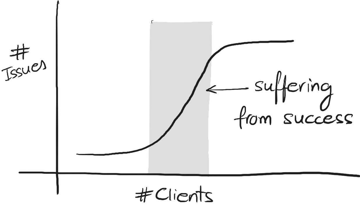
More clients → increased chances for error → more issues.
Process
Looking back at my notes, I could split my process into 4 phases.


Learn
There were a few ways I could learn about the problem.
via a Lifecycle Diagram
To start, I followed an issue around as soon as it began. I got in touch with anyone this issue made contact with and chalked up a diagram.

via Interviews
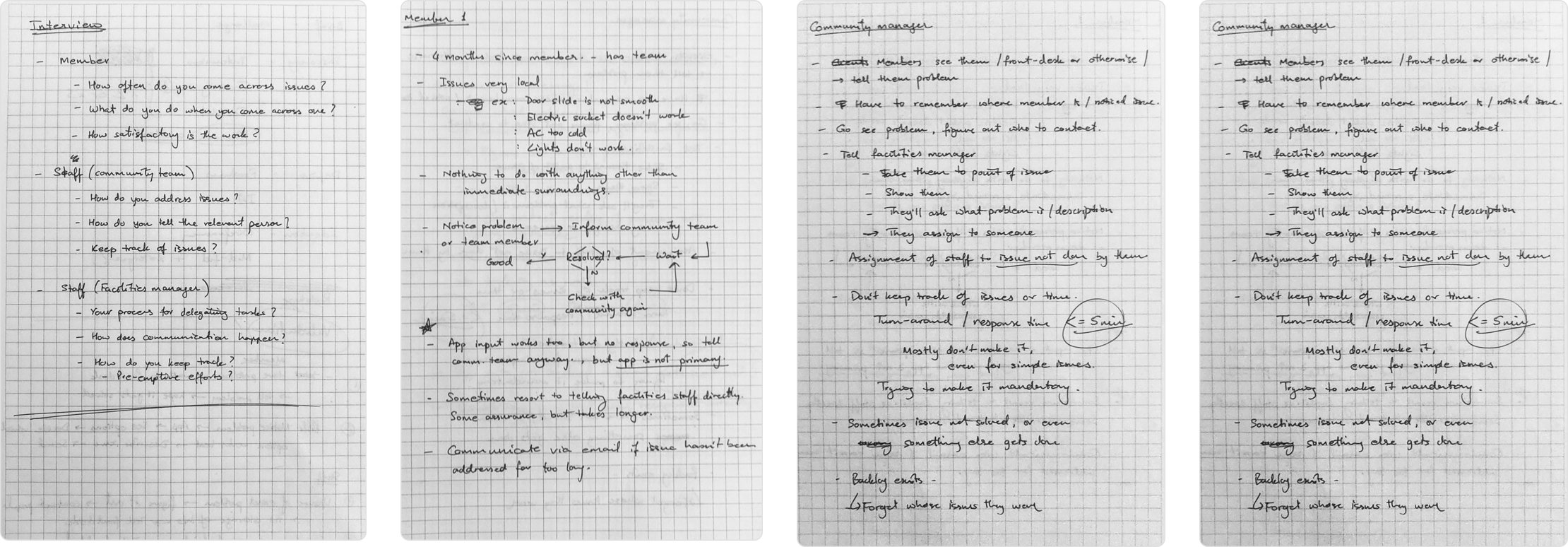
Having followed an issue through till the end, three players come to light: the client, the community manager, and the facilities manager of that space.
From the client’s perspective, I wanted to know how they go about raising an issue in the physical world and through the app.
From the client’s perspective, I wanted to know how they go about raising an issue in the physical world and through the app.
Using Data
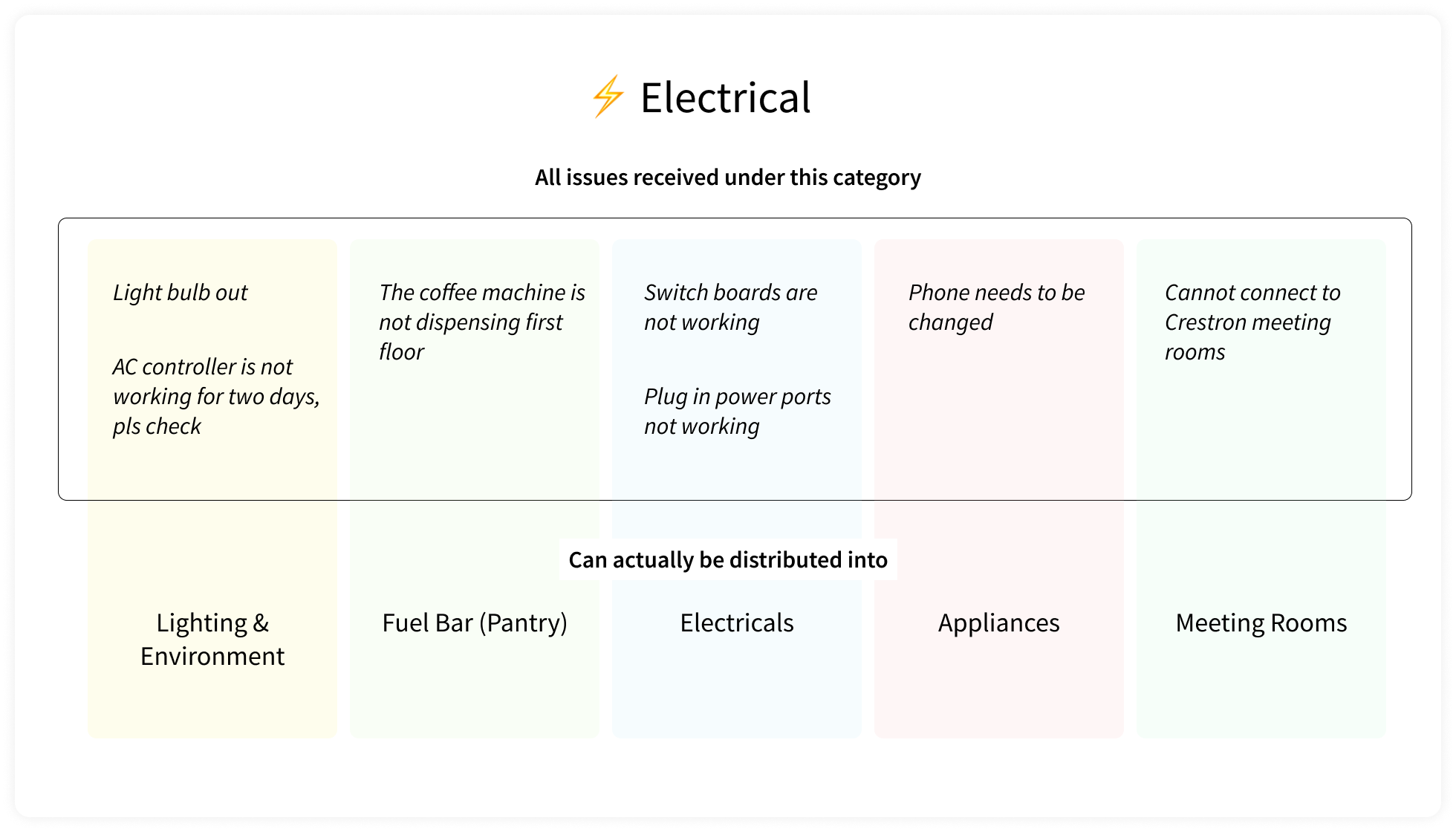
Remember version 2, when clients had to pick a category on the app and just write it out? I pulled ALL the complaints we had ever received into a spreadsheet. What I found:
✨ Raw data. So much raw data.
It took some time to sift through, but once we did we noticed some patterns.
Discovered Pain Points
No status info
Clients have no idea what’s happening.
Inefficient flow
Communication occurs verbally or by email.
Constrained communication
The given categories don’t help enough to narrow the issue down.
Location dependence
Most issues are very specific to their location.
Only backlog, no tracking
All issues go in and out of a backlog, but no detailed tracking exists.

Give it some structure
Now how do we give it structure?
via Personas
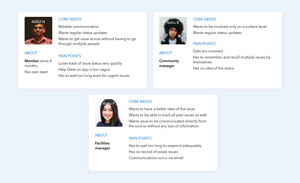
From the above interviews, a set of personas has been created to help understand each person’s point-of-view throughout the lifecycle.
via Feature Brainstorming
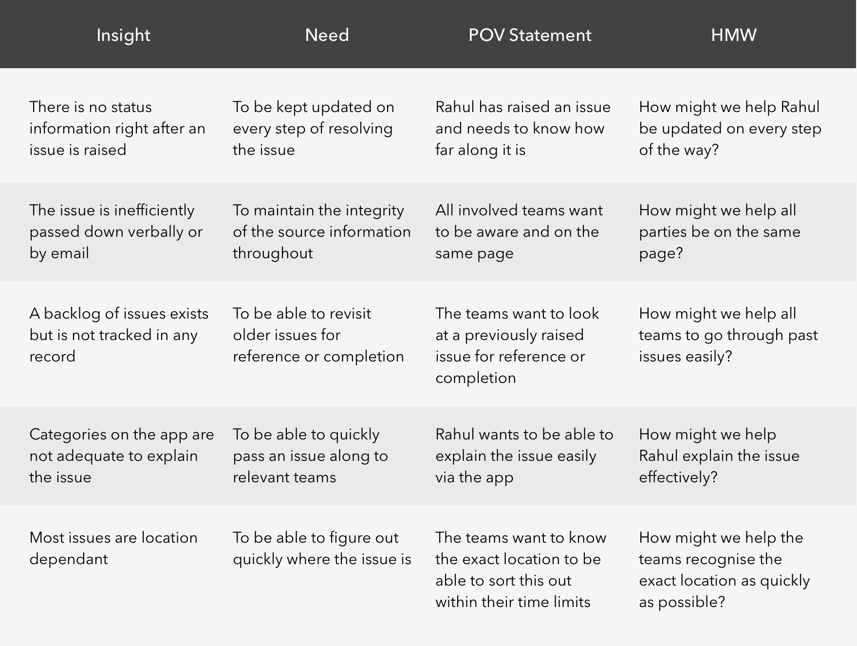
To brainstorm features for the Support section, I created How Might We and Point of View Statements using insight from my interview.
via Information Architecture
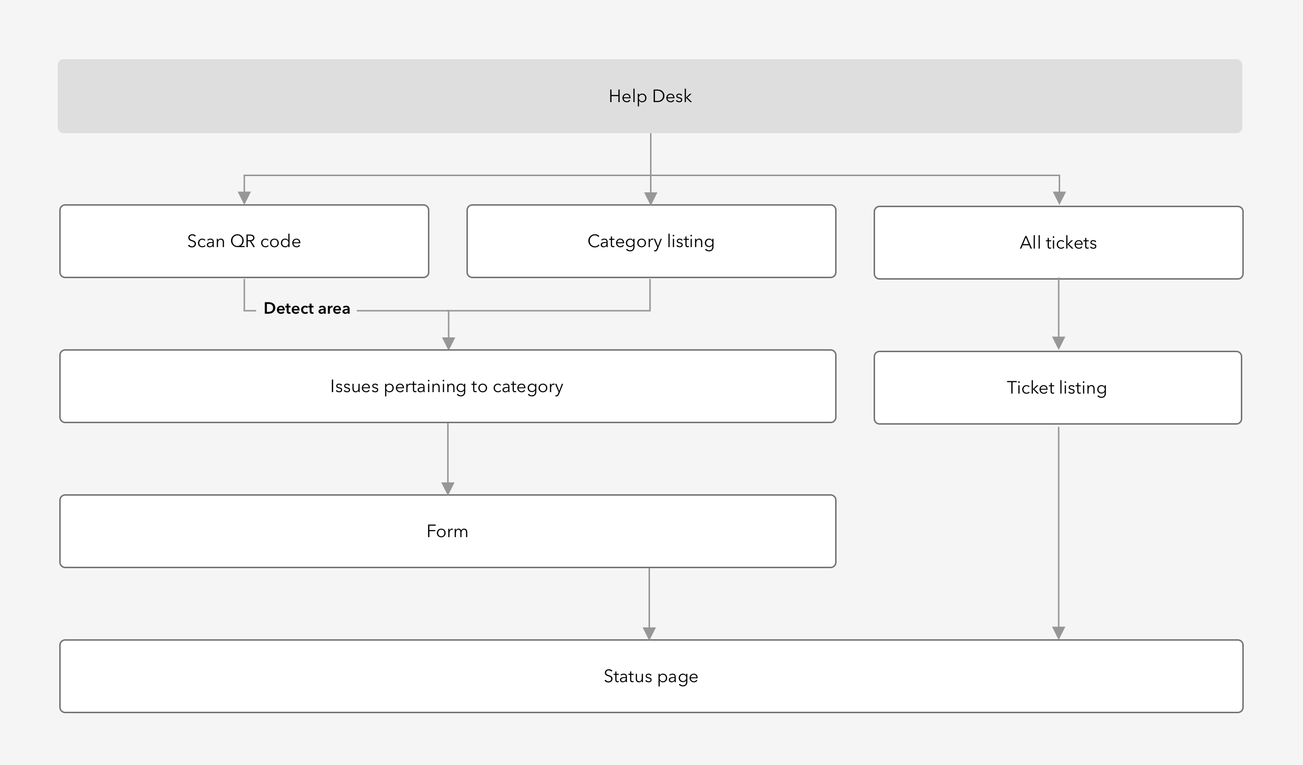
A simple information architecture crafted using the ideas from above.

Ideate
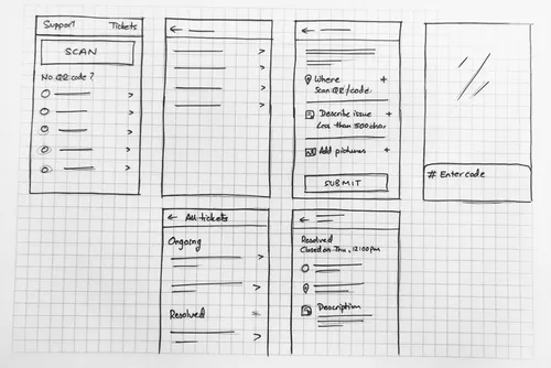
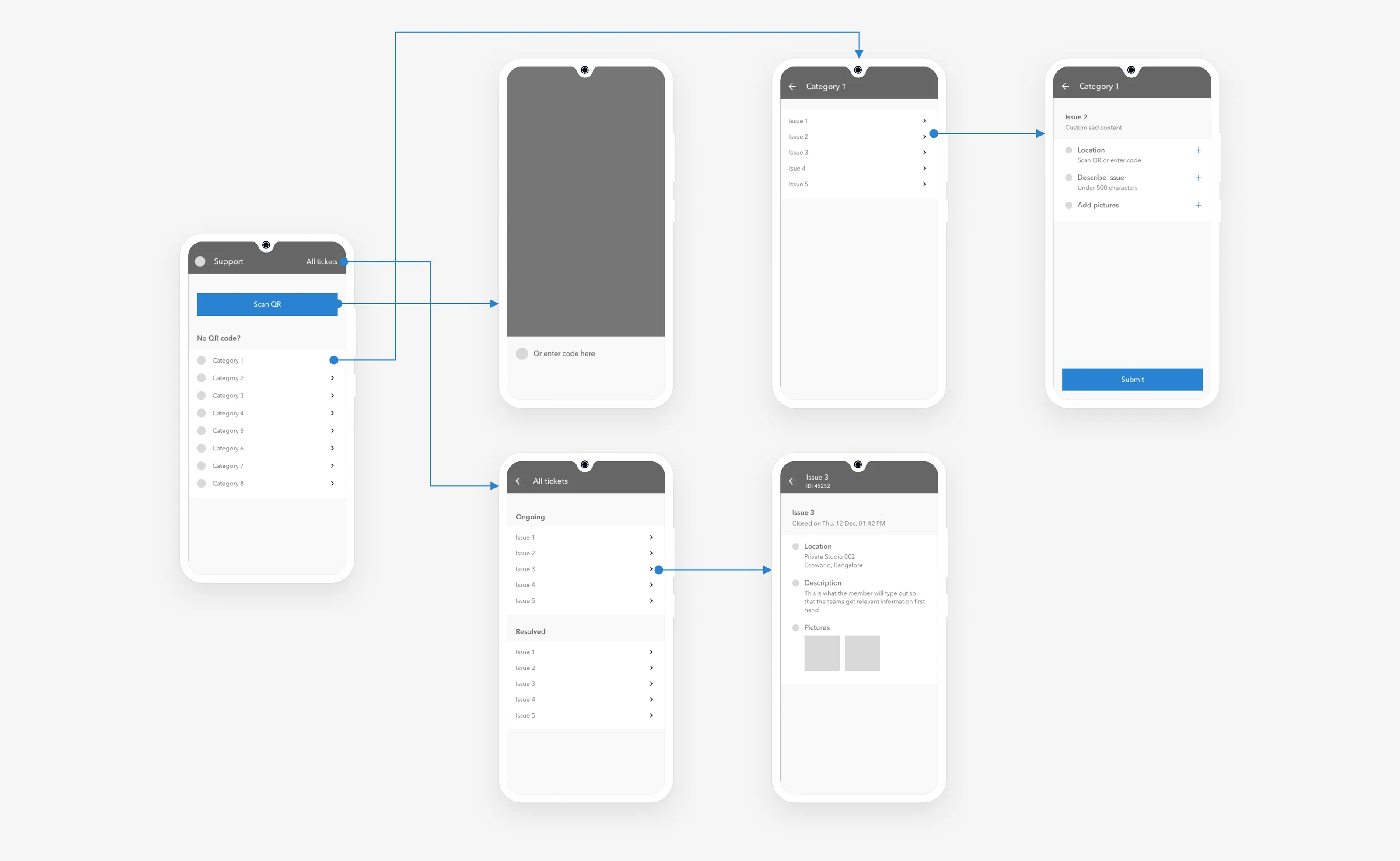
Basic sketches and mid-fidelity wireframes
Keeping all gathered information in mind, I explored a few wireframes on paper and then created a set of mid-fidelity wireframes of all of the key screens needed to complete the main user tasks that are part of this journey: raising the issue quickly and effectively, and view status of a raised issue.

Wrap it up!
I wanted to keep the final interface clean to avoid unnecessary distractions, so I just went with our brand colour and two shades of gray to wrap it up.
Many new components were created and added to the existing system.
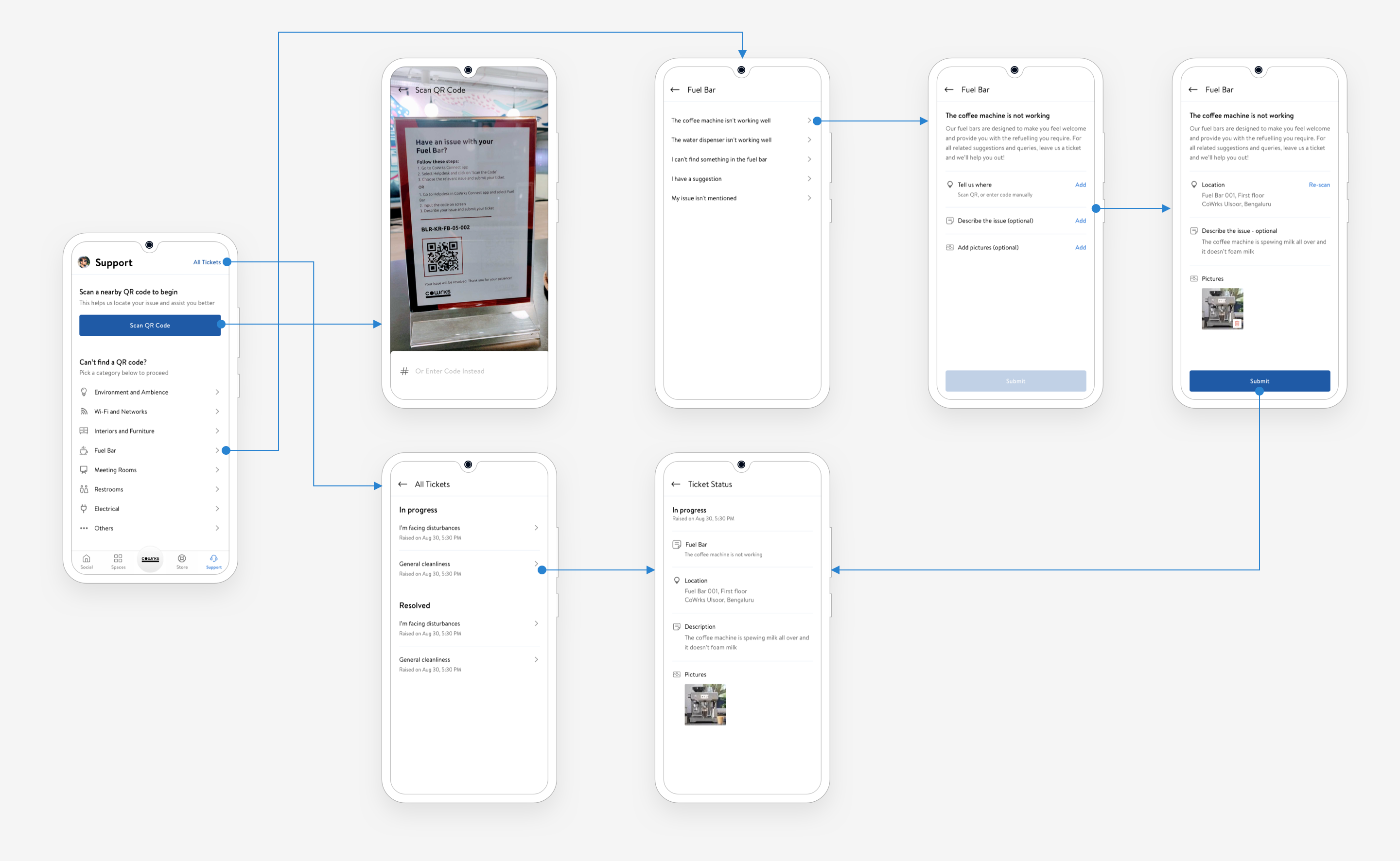
🥁 Results
A streamlined process allowed for our clients to raise complaints with ease and see them get resolved much quicker and with far more visibility than before.
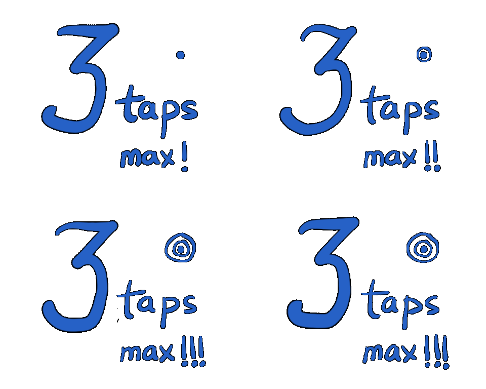
to submit an issue
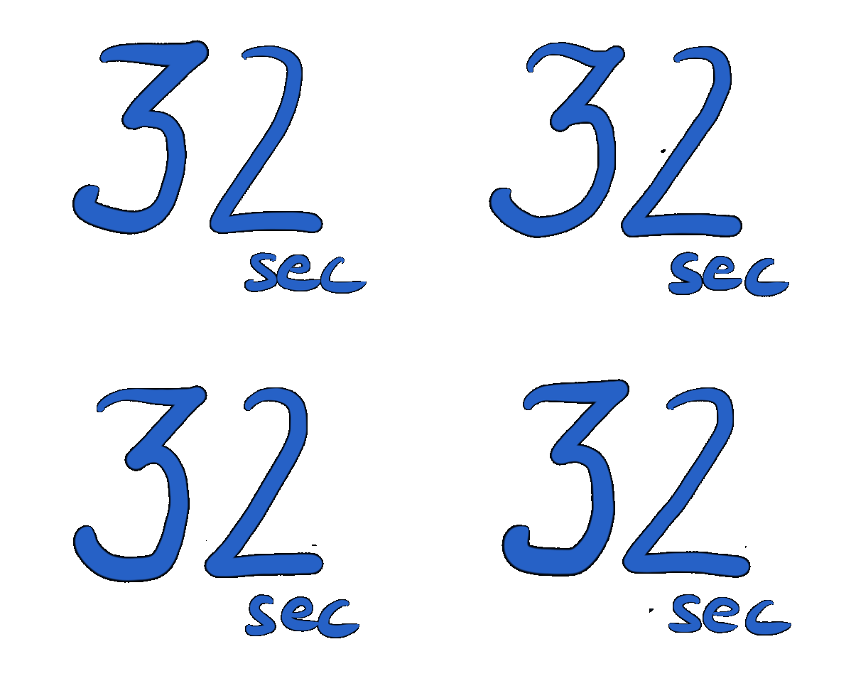
New avg response time
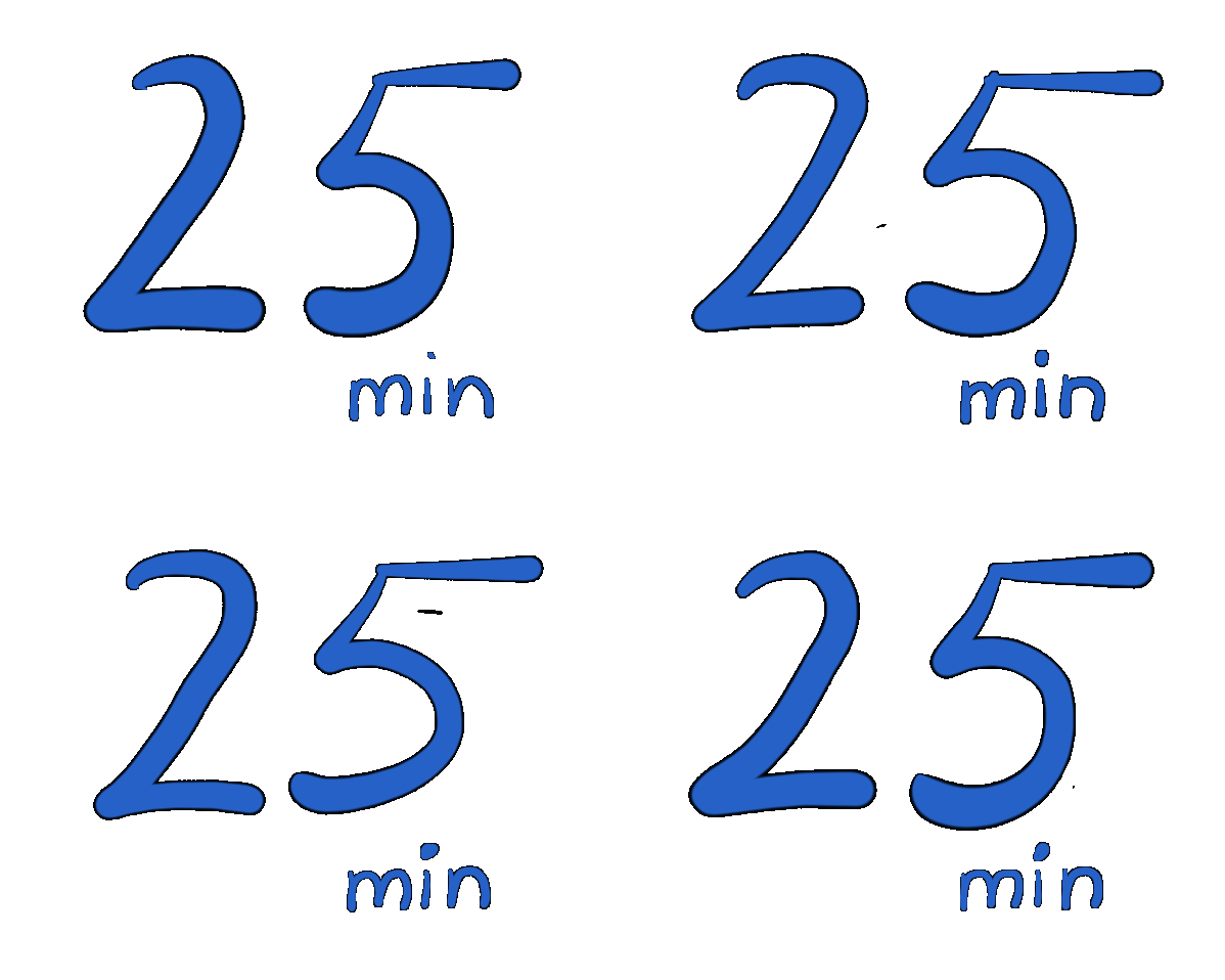
New avg resolution time
What changed
Relevant issues were being addressed
Tickets were now spot-on in addressing the issue since the options clients had to pick from were more relevant this time.
📏 The process was now streamlined
The third-party tool that the tickets were routed through streamlined the process of assigning tickets to the right person/team, thereby reducing acknowledgment and response times.
Increase in member satisfaction
Member satisfaction increased owing to quick response and resolution times, adequate feedback, and fewer redundant interactions with our people.
Quicker completion times
QR location codes coupled with relevant issue options to pick from meant that describing the exact problem wasn’t even required every time a ticket had to be raised.
Improved organisational efficiency
All tickets were now tracked via a centralised system, helping identify frequently occurring issues and how to pre-emptively address them, and analysing feedback to improve existing systems and processes.