Setting Up Halodoc's Design System
SUMMARY & IMPACT
Co-created the design system at Halodoc by setting up foundational components. Helped move it outside Figma by collaborating with engineers to turn it into a live product actively used by designers and engineers.
- Company
- Halodoc
- Role
- Co-Lead
- Team
- Designers, Engineers
- Read time
- 8 min
A brief history
When I joined Halodoc, fragments of frequently-used components existed on Sketch and Figma. When we moved into Figma entirely, this was our system:
- Reusable components that existed not as a library but as a file in Figma.
- Limited documentation meant to aid only designers that existed and was maintained on Confluence.
Audit and preparation
You know where this is going.
In due time time, this setup buckled and began to show cracks under the weight of broader use.
Since the commonly used components existed on some other file, it was easier to just pick it up from the last file we worked on and copy-paste it to our context.
This lead to a Telephone like result where small changes would get introduced to the original component with ALL variants existing across the app.

Extending past Figma
The simplest way to work on a design system is to audit, create components, and document it within Figma. A better, long-term solution would be to extend the system into the product and get the engineering team involved as stakeholders.
Once our design managers secured the buy-in, we worked with engineering to figure our best foot forward.
It was decided that we would use tokens, wrap all of it in a JSON file and use that file to talk to the components used directly in our applications.
Designing to scale
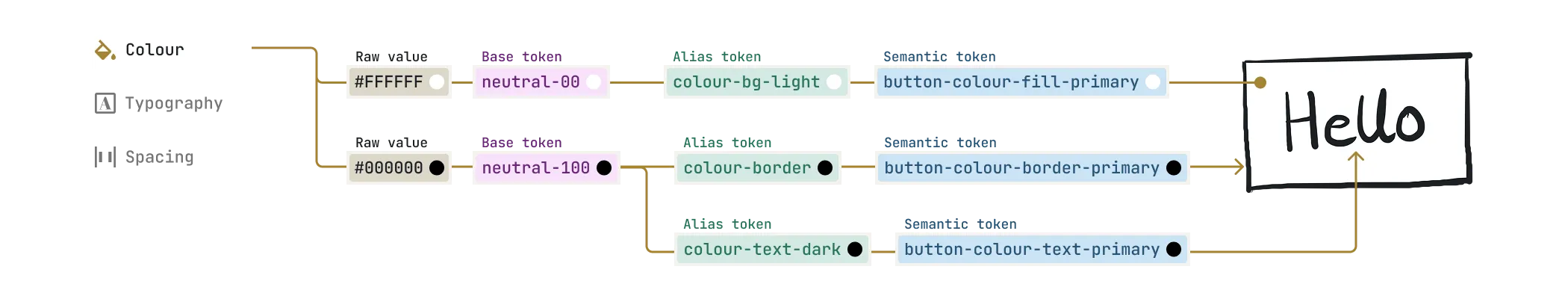
To accommodate for any changes that we may want to make any time in the future, we created a hierarchical token structure of
- base tokens
- alias tokens
- semantic tokens
Jumping right into recreating components sounded so tempting, but we needed to take a step back. To make this an engineering-friendly system, every fundamental unit of space, size, colour, and typography would have to defined and be represented by a token. Every. Single. One.
Building with tokens
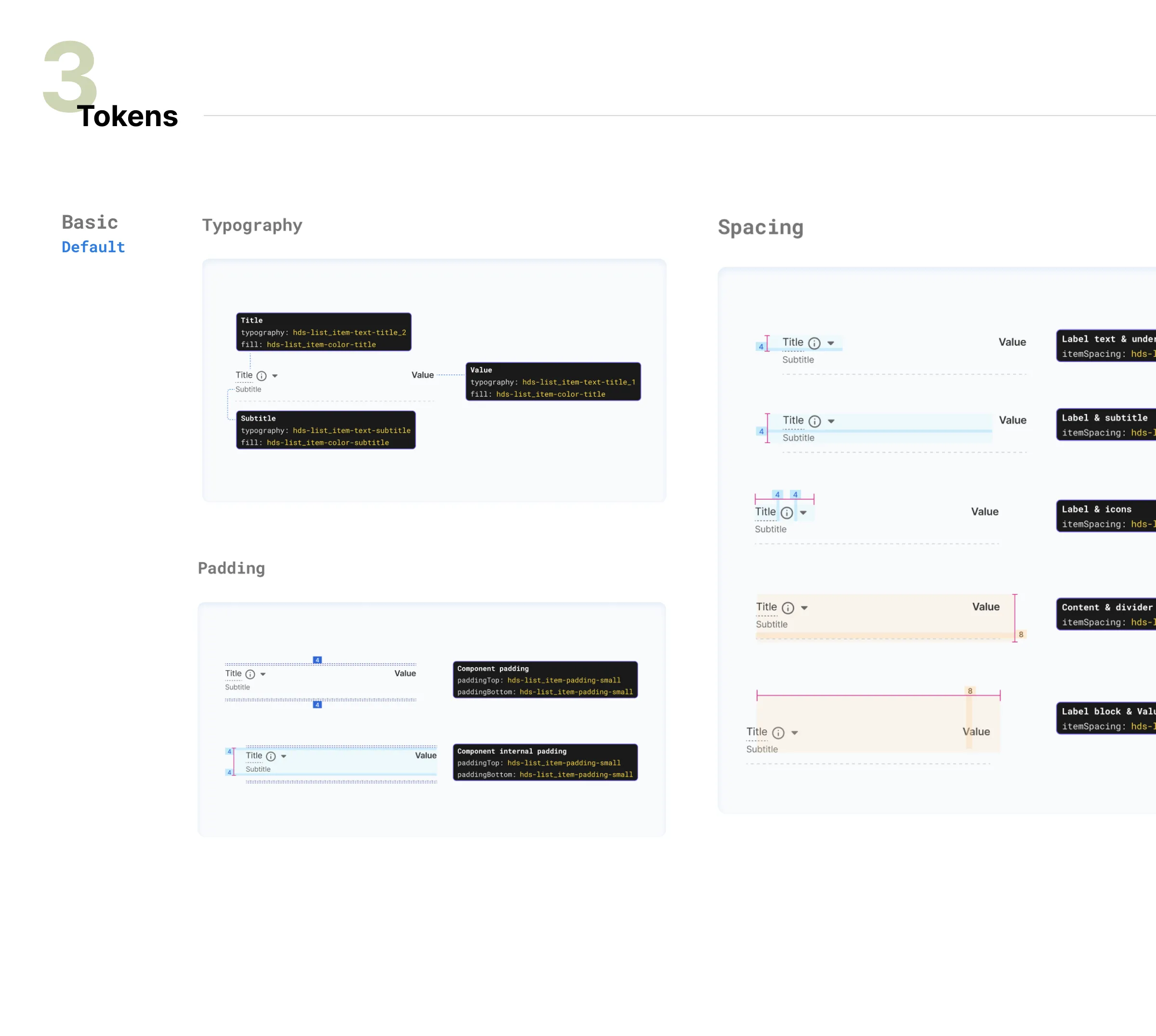
What makes this system scalable is that every property of a component is defined and mapped to a fundamental unit.
To allow for changes without disturbing the fundamental value, each property was initially mapped to a semantic token, which points to a base token, which points to a raw value.
After discussions with engineering, it was decided that it was best to introduce an alias token between the semantic and the base tokens.
Documentation
Once we set the rules of scale, we divided the work amongst our team and picked components to set up.
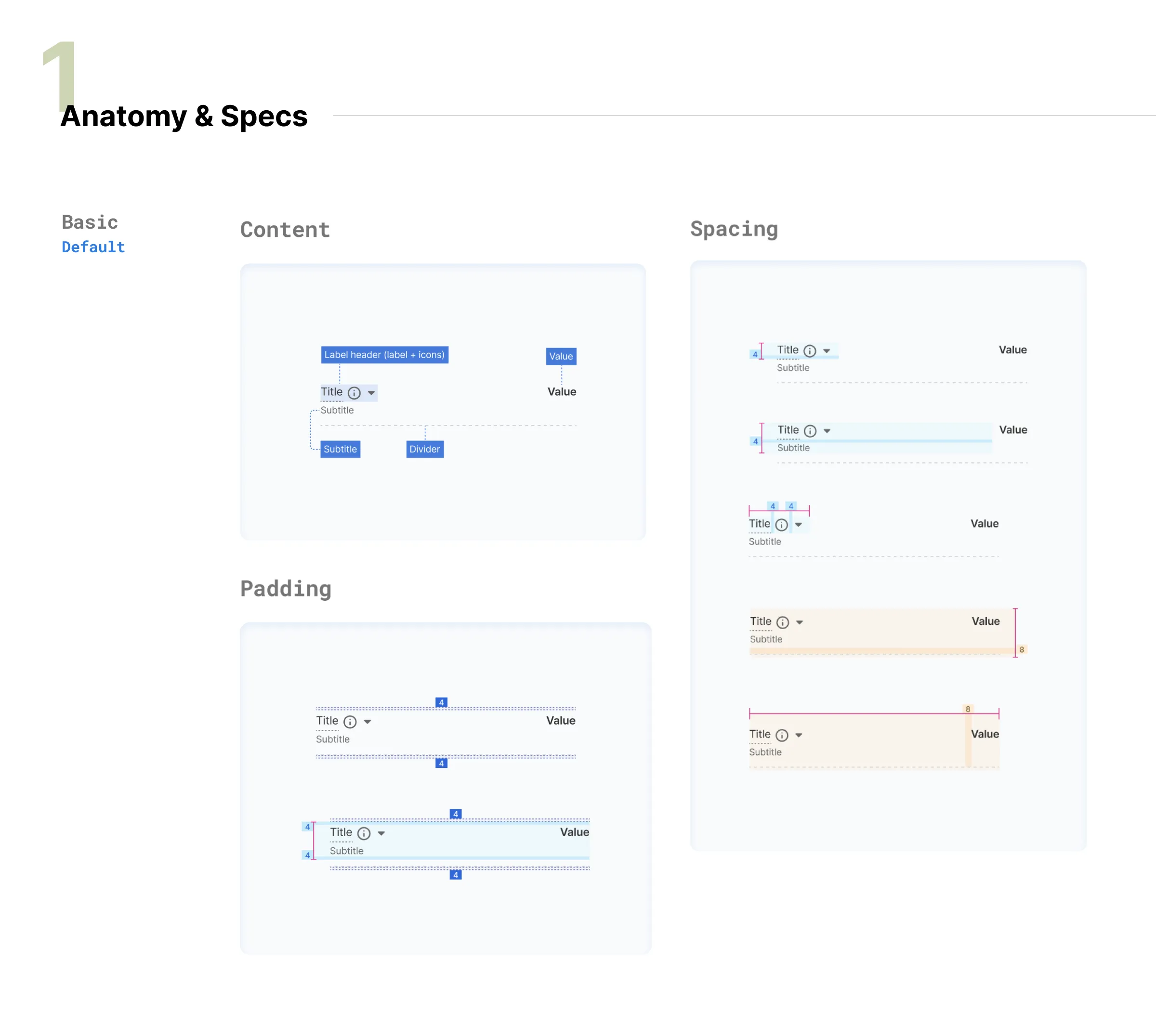
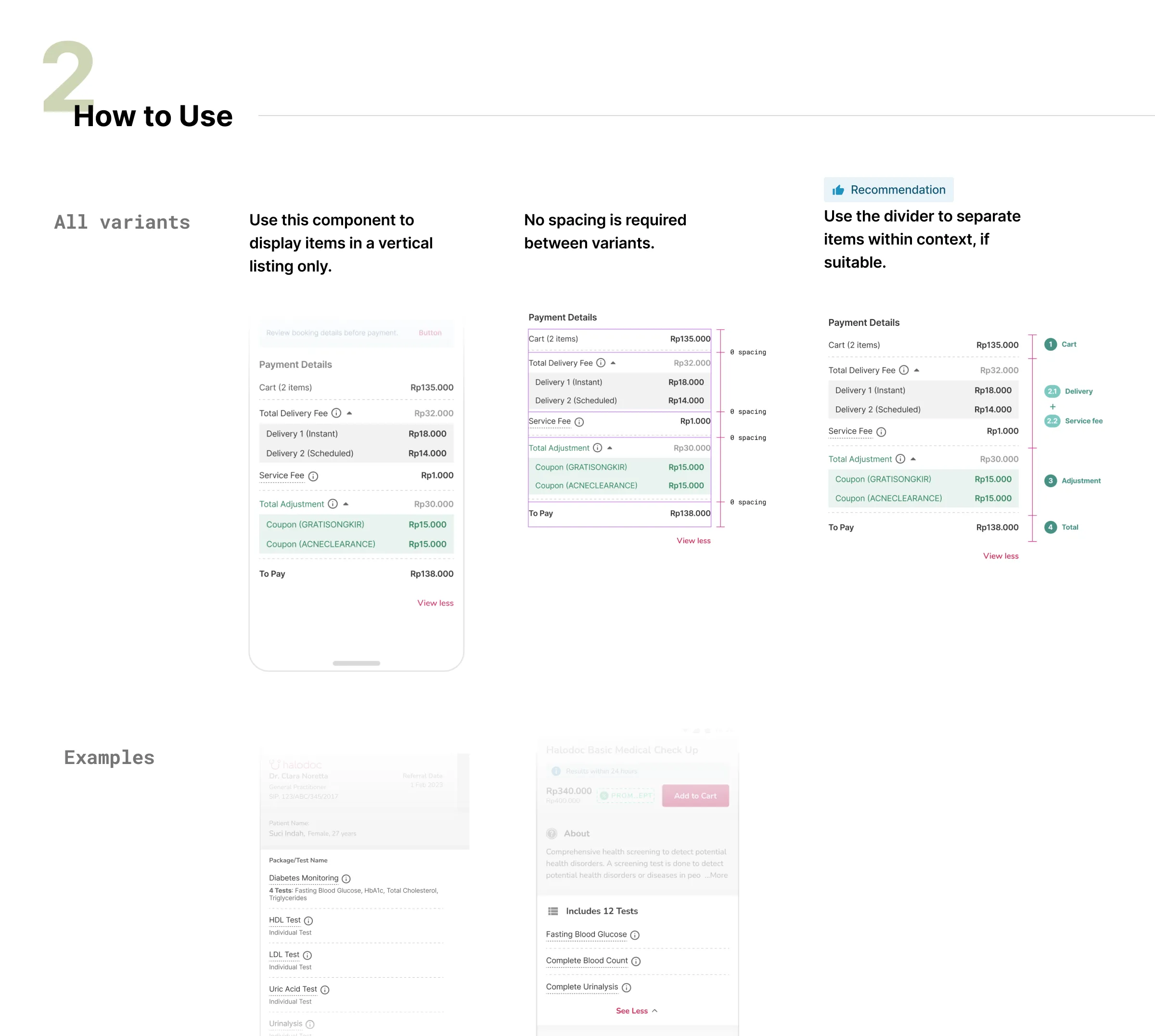
We would gather instances of components on our production app and attempt to reduce them to as few final components as possible.
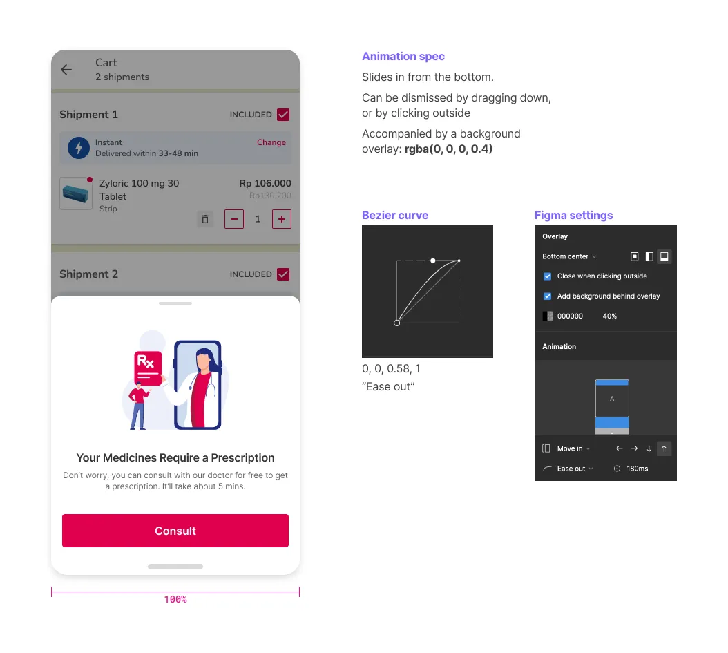
Using a defined template to document, we used states to demonstrate the interactions and showed in-depth documentation on usage guidelines and differences across variants.
Seeing it through ft. engineering
The engineering team tasked this as a priority and set aside a few shared engineers.
After developing a group of components, we would be asked to sign-off so that it can be kept for use in production.
Updating components
As mentioned earlier, the engineering team came up with a novel way to allow us to make edits without having to always involve them. Tokens for each parameter were be mapped to the relevant component using the JSON file that contained all the tokens.
Depending on the scale of what we wanted to change, we could modify either the alias or the semantic token.
Governance
The JSON file with all the tokens was stored in a code repository, where only one of us would have the authority to merge changes with the main branch.
If anyone wished to make a modification to any part of a component, it would be taken through a review with the rest of the team who would collectively decide if the modification is absolutely required or not.
This ensured that everyone was onboard with the change before it was pushed to production.
Final Thoughts
Component libraries work great for designers who want consistency in their designs, but what separates it out is a shared vision between design and engineering.
And it’s not just component libraries. Design systems include illustrations, tone & voice, information architecture, and content strategies.
To start being effective, the design system needs to:
- Extend past Figma (or any other tool used to make it).
- Have a process for reviewing new components and modifications.
- Have a culture of critique and feedback.
- Be a joint effort between engineering and design.