Designed an onboarding flow after a complete revamp of an app.
Design, copywriting
At CoWrks, a dynamic co-working space, our mission was to make clients feel at home and maximise their workspace experience. A big part was helping them get onboarded to an app designed to keep life simple—tracking everything from daily functions to contract renewals and credit balances.
This case study dives into how we made the app onboarding process fun and seamless, ensuring clients had everything they needed at their fingertips for an efficient, hassle-free experience.
It's the name "Honcho", isn't it.
What? No no, “Honcho” is fine.

...you sure?
Yes. 😌
Okay, then what? 🤔
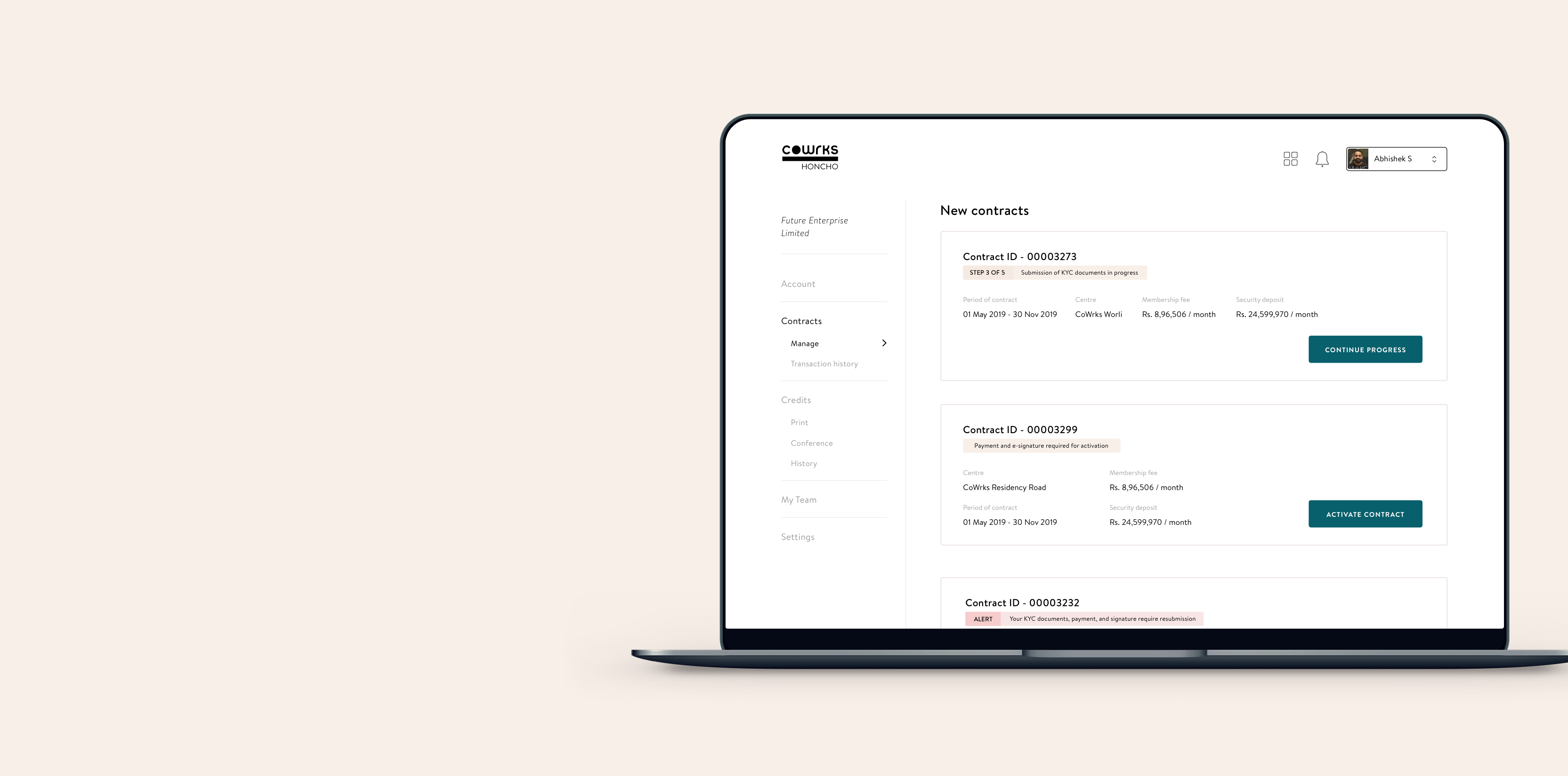
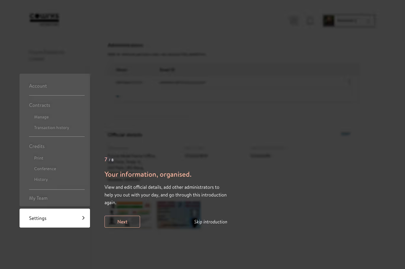
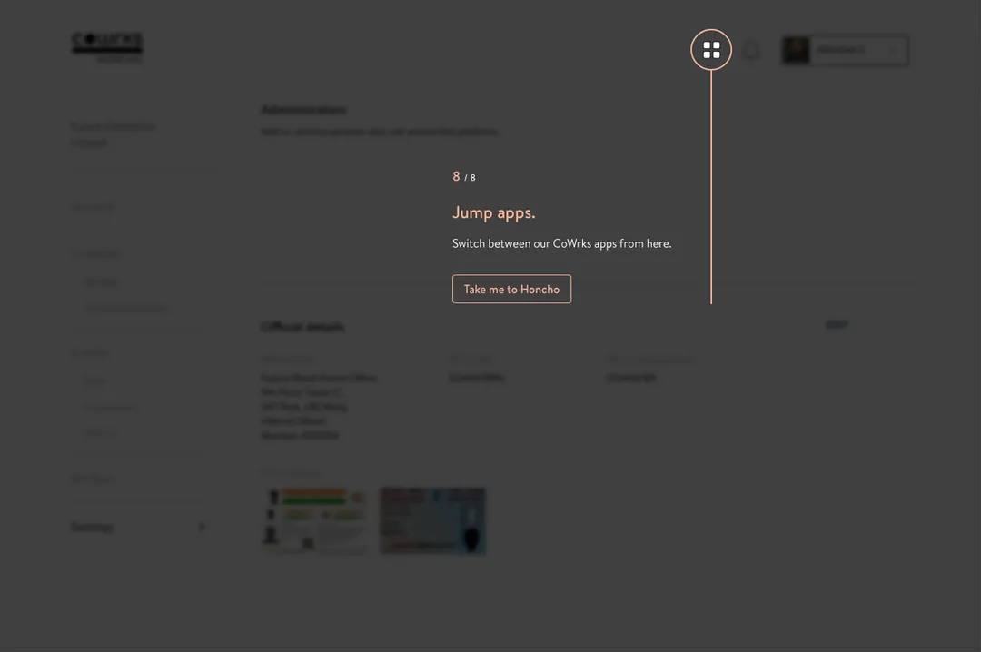
Honcho was a key feature in our member app, designed to connect admins to the larger co-working community vibe.
But first things first—they had to sign up for the member app and then find their way to Honcho, which turned out to be trickier than expected! We noticed that many of them were having trouble just reaching the app.
Plus, admins didn’t always work from our space, so they couldn’t access the member app (or Honcho) when needed.
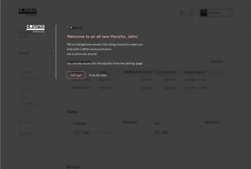
Once the admins got into the app, they were pretty much on their own to figure things out. Although it started off with basic functions, a steady stream of new features—and a big redesign on the horizon—made it clear that an onboarding experience was in order!
We wanted a consistent look and feel across all our products, and Honcho was long overdue for a visual upgrade to match the brand.
Simply put, they’re busy people who have a lot on their plates. They're either heading their teams or handling financial matters.
They might not be incredibly tech-savvy but are used to SaaS products since they often have to work with data and dashboard-centric apps.
This app is not their primary tool of work, and are possibly breaking away from their work to attend to something that Honcho can help them with.
Revamping the UI was bound to shake things up, breaking a few of the good (and not-so-good) habits admins had built up with the app. Plus, tossing them into a brand-new interface without guidance would cost them precious time.
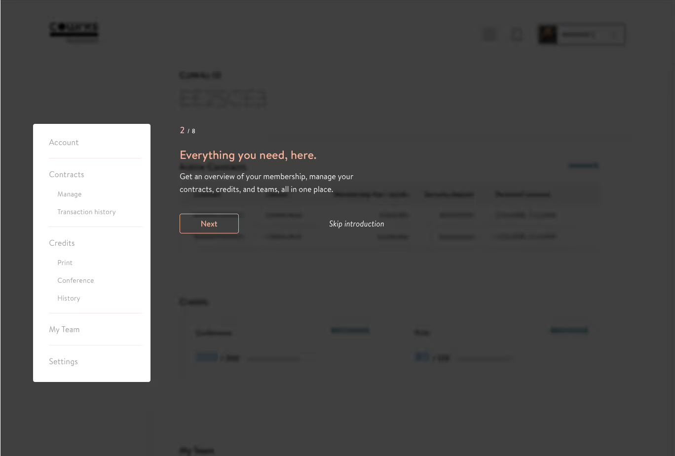
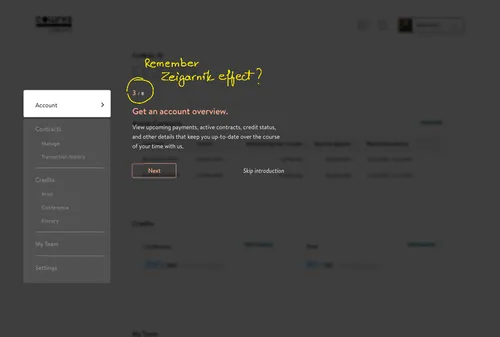
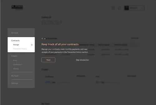
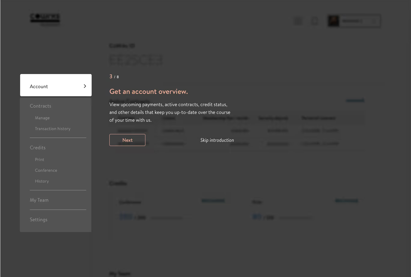
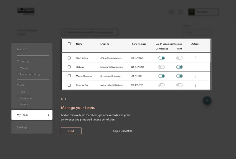
With this in mind, we knew we needed a smooth onboarding flow to help users get comfortable with the redesigned Honcho from the get-go.
We wanted the admins to see the real value of the product right away, so we designed the onboarding to include a quick, hands-on task. Nothing like a little involvement to make them feel invested!
We wanted the admins to see the real value of the product right away, so we designed the onboarding to include a quick, hands-on task. Nothing like a little involvement to make them feel invested!
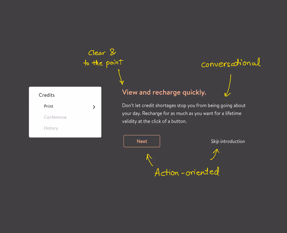
An onboarding flow is a vulnerable place to be, so we kept the words and phrases as recognisable as possible. It isn’t home, but it’s a safe place to be!
To connect with our users, we wanted Honcho’s personality to be:
1. Clear and to the point—no confusing lingo.
2. Friendly and conversational—just the right balance, without being too casual.
3. Action-oriented—motivating, but never pushy.
Honcho is mostly a data-driven app with a few action points, and it also syncs with a third-party tool—so there were some unique challenges here!
Keeping the interface clean and readable was no small feat, especially when every piece of data felt essential. Prioritising visibility got tricky when everything seemed important.
Since Honcho connects with another app, understanding the ins and outs of that third-party tool was critical to creating a smooth, cohesive user flow. Overlooking details in one app could easily lead to less-than-ideal design decisions in the other.